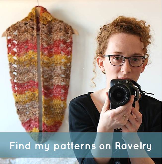
One of the things I enjoy most about designing yarny things (apart from buying LOTS of yarn), is playing with different colour combinations. It isn't easy - there are many theories on why certain palettes are particularly pleasing to the eye. Getting it right takes practice. I have to practice, for every project I do. Sometimes I get it right, and sometimes I have to go away only to realise I really didn't. Often I'm swayed by trends or too many pinterest-hours, and have to struggle to come back to what defines my own style.
No matter what happens, however, the process is great fun. I look for interesting colour schemes everywhere; I may or may not have once tried to photograph a bit of a stranger's jacket, it was that good. Looking around me for inspiration teaches me to think beyond my own comfort zone colours (grey+blue and maybe a hint of something warmer, as the palette of this blog will tell you!). When a certain combination captures me, it turns into an obsession. Before long I'll try to look for it everywhere, photograph it, make stuff with it, bring it into my designs and even look for socks that match (okay maybe not quite, but almost!).
To document these palettes I'm starting the Colour Obsessions series. Perhaps it will inspire you to try new combinations too, and if you're on Instagram feel free to use the #colourobsessions hashtag to show me your favourite colour schemes.
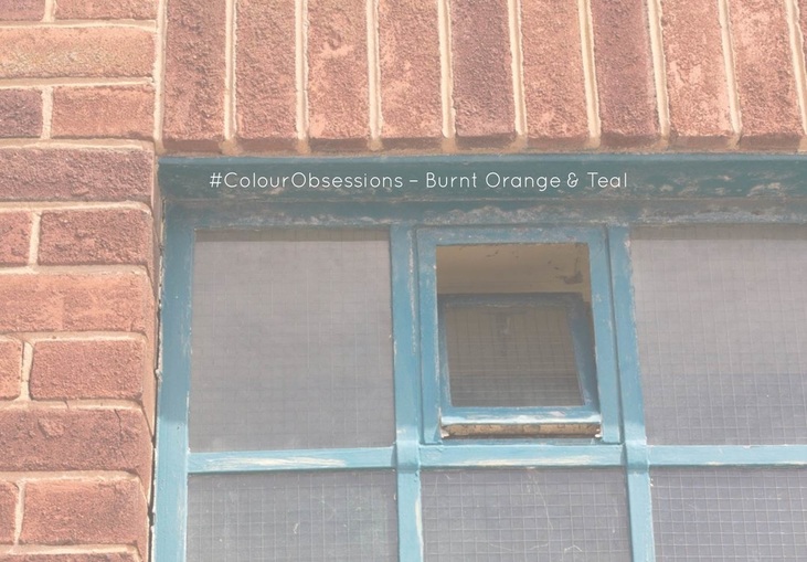
This week I'm starting off with a combination I'd never given much thought to but which I now love love LOVE:
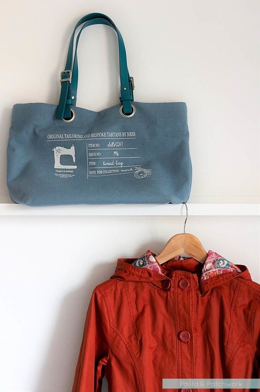
An impulse buy from Ness when I visited York last year (and couldn't cope with the bracing British weather after 4 years in Milan at all!) is entirely to blame for this obsession, I think.
In case anyone from Ness is reading this - if you ever decide to make a Swedish winter-appropriate version of this coat I will be the first to snap it up, I promise!
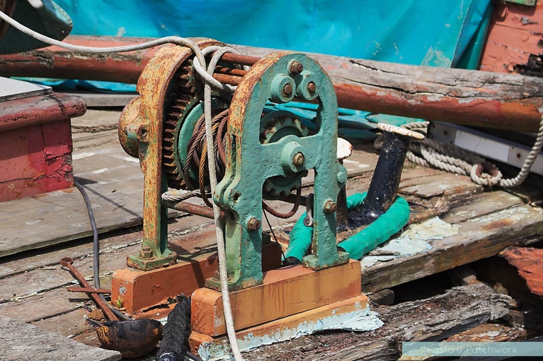
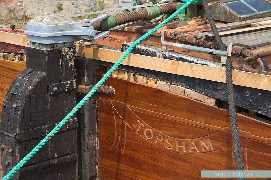
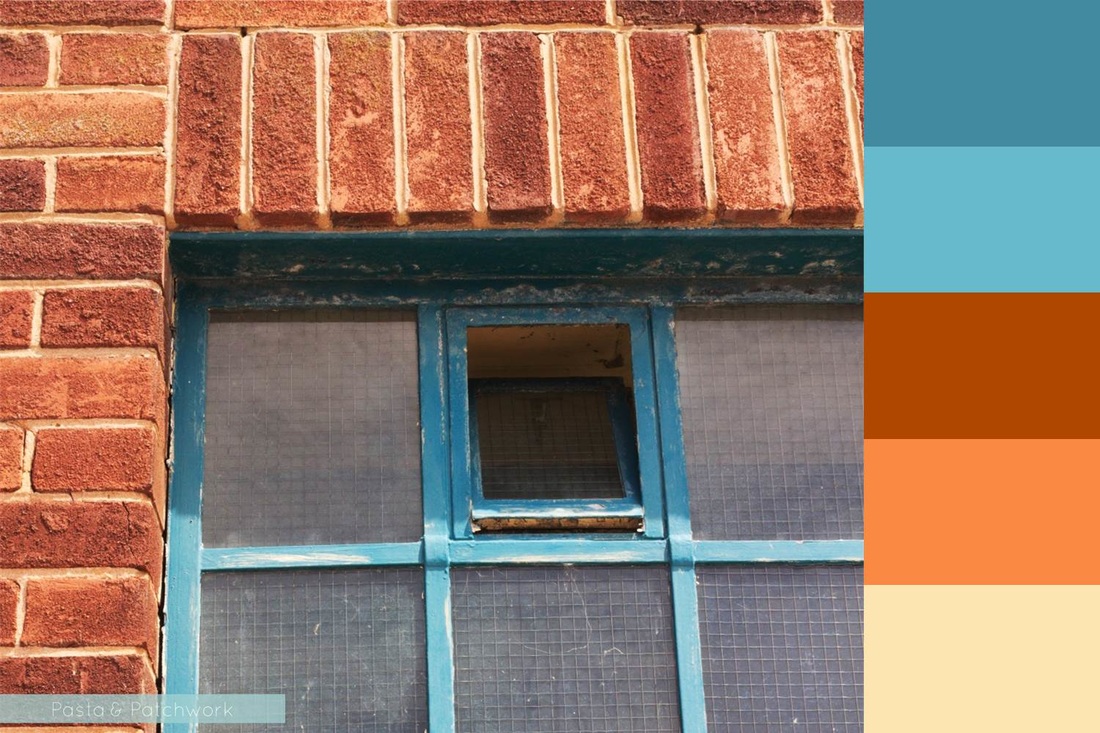
Anyway, after the accidental coat+bag incident came my usual game of "spot that colour combo". Turns out shipyards are quite a good place for burnt orange and teal/turquoise.
Anyway, after the accidental coat+bag incident came my usual game of "spot that colour combo". Turns out shipyards are quite a good place for burnt orange and teal/turquoise.
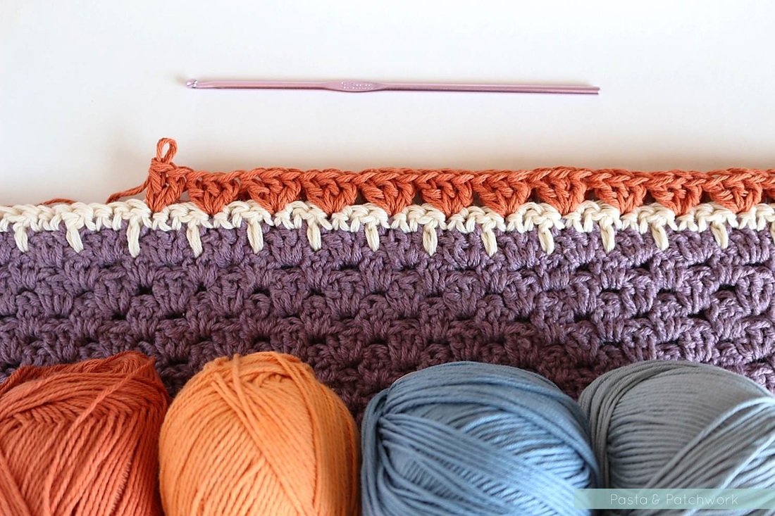
I haven't gone as far as to incorporate this scheme into my own designs, but the burnt orange has been creeping in to some other makes. It love how it worked with purple in the Nordic Shawl
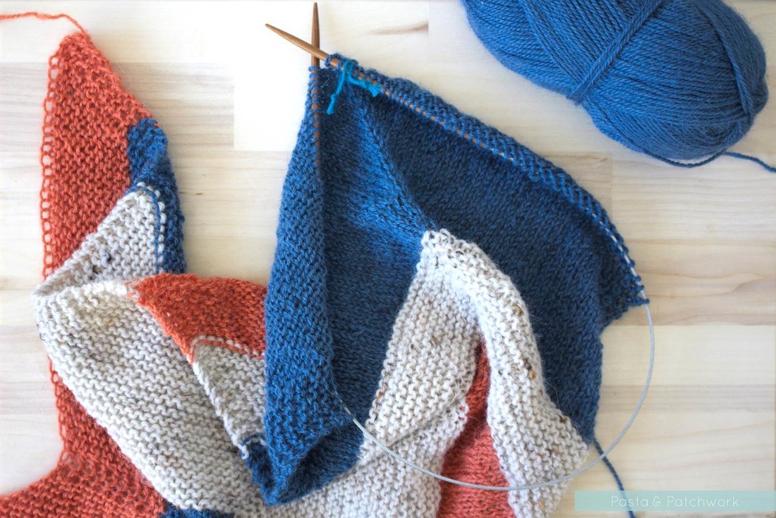
I've recently gone over to the dark side and taken up knitting (I know!), and for my very first attempt at knitting something wearable I've chosen orange and indigo. I really like it, but how hilariously gappy is that casting-on row! I think I need a bit more practice at this too...
So there you have it, my first in a series of Colour obsessions: Burnt Orange & Teal
What do you think, does this colour scheme rock your boat, or is it not for you?
Come say hello:
